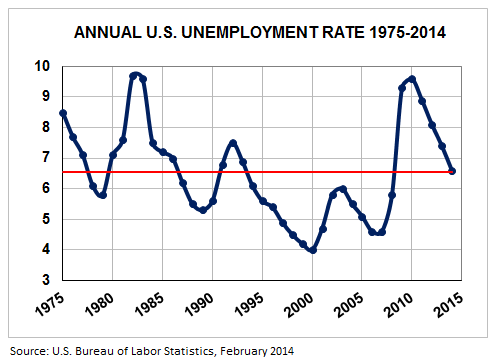
Since the political party in power will always try to spin economic data postively, while the opposing party tries to convince you the country is still in the doldrums, sometimes it's nice to put metrics like the U.S. unemployment rate in perspective by showing historical data without political interference. Accordingly, below is a chart of the unemployment rate over the last 40 years. As you can see we are back down to "average" today (the 40-year mean is the red line), so things are neither great nor terrible. That's surely not what you'll hear as the mid-term elections get into full swing this year, but that's yet another reason why politics and investment strategies shouldn't be mixed. Investing is far more dependent on reality than politics.

Registered Investment Advisor
Bound to Fiduciary Standard
Serving clients nationwide
Your Custom Text Here
